Choosing a carpet color might seem simple at first, after all, it’s “just flooring.” But in 2026, carpet isn’t just a functional surface underfoot. It has become a central design element that anchors a room, conveys mood, complements textures, and expresses personality. From earth-inspired warmth to calming pastels, the carpet color trends this year reflect broader shifts in interior aesthetics: comfort, connection to nature, and visual serenity.
In this blog, we’ll explore what carpet color is most popular right now, why it’s trending, how to style it, and what to consider before installing it in your own home.
Why Carpet Color Matters More Than Ever
Carpet plays a unique role in interior design, it sets the visual tone for an entire space. Unlike paint or furniture, carpet covers a large surface area but is often overlooked until design conversations begin. Today, homeowners and designers approach carpet color with intention. It’s the foundation that supports the rest of the decor.
Here’s why carpet color trends are important in 2026:
- Holistic Interiors: Floors now interact with layered materials, textures, and natural elements (wood, stone, plants).
- Psychological impact: Carpet color influences the feel of a room, warm tones can make a space feel cozy; cool tones can create calm.
- Practical aesthetics: Carpet needs to hide wear, complement furniture, and withstand daily life.
With these priorities in mind, let’s break down the most popular carpet colors today.
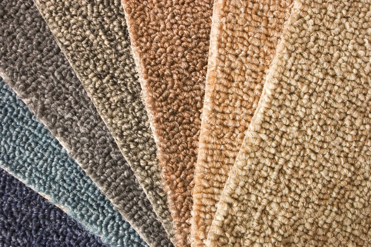
1. Warm Neutrals: The New Classic (and the Most Popular Overall)
If you were to walk into carpet retailers around the world in early 2026, warm neutral carpets , think caramel cream, mushroom beige, toasted oat, and soft nougat, would be dominating the floor sample boards.
Why they’re trending
Warm neutrals serve as a perfect backdrop in a world that’s shifting away from stark minimalism. Designers and homeowners alike are looking for carpet that feels inviting, effortless, and timeless. Unlike cold grays of the past decade, these softer tones bring warmth to open-plan living spaces, bedrooms, and family rooms without clashing with wood finishes or metal fixtures.
How to style them
Warm neutrals are incredibly versatile. Pair them with:
- Wood furniture: Light oak or walnut create refined contrast.
- Natural textiles: Linen, cotton, and wool bring texture without distraction.
- Accent colors: Greens, blues, or earthy rust tones pop beautifully against warm floors.
Best rooms
- Living rooms
- Bedrooms
- Open-plan spaces
They keep spaces feeling cohesive while also camouflaging light use and foot traffic, a practical and stylish choice.
2. Earth and Nature-Inspired Hues
Beyond neutrals, earth tones are surging as one of the year’s most exciting carpet color categories. Shades like sage green, clay taupe, sandy wheat, and terracotta-inspired hues reflect a deep biophilic influence, a design movement that brings nature into the home.
Why it’s catching on
Today’s interiors prioritise wellness and connection. Earthy carpet colors evoke natural landscapes, grounding the space and fostering relaxation. These tones pair exceptionally well with natural wood, rattan furniture, and indoor greenery, creating a serene, sensory-rich environment.
Popular earth tones
- Soft moss green – subtle yet alive
- Clay taupe – earthy neutral with warmth
- Sandy wheat – light golden neutral
- Terracotta peach – warm, sun-washed charm
Style tips
Use earthy carpet in spaces where you want calmness, think home offices, bedrooms, or reading nooks. Pair with cream walls and woven accents for a natural, peaceful aesthetic.
3. Tranquil Blues and Calm Pastels
While neutrals and earth tones dominate broad popularity, calm blues and soft pastels are also emerging as designer favorites, especially in private spaces like bedrooms or creative areas.
Why they’re trending
Blue is timeless in interior design, but the 2026 interpretation leans toward peaceful coastal inspirations and spa-like serenity. Pastel blues and misted gray-blues create a relaxing vibe without overwhelming.
Where they work
- Bedrooms
- Lounges and reading rooms
- Beach-inspired interiors
These shades bring a refreshing subtle color that still feels refined and elegant.
4. Rich and Bold Tones for Statement Spaces
Not every carpet needs to be neutral, 2026 also sees deep, dramatic hues gaining traction for statement areas of the home. Think midnight blue, charcoal, burgundy, moss green, and even jewel tones.
Appeal of bold carpets
Bold carpets anchor rooms that house rich design features, like brass accents, velvet furniture, or dark wood. A deep, saturated carpet adds drama and sophistication, pulling furniture and accessories together in a deliberate, styled way.
Best uses
- Formal living rooms
- Home offices
- Dining rooms
- Media rooms
These colors can elevate a room from cozy to curated.
Practical Tips Before You Commit to a Carpet Color
Choosing a trendy color isn’t enough, you must consider your lifestyle and space:
1. Lighting matters: Natural and artificial lighting dramatically impact how a carpet color reads. Warm neutrals look creamier in natural light, while blues might seem more muted under soft indoor lighting.
2. Traffic and maintenance: Light carpets show wear and dirt more easily; darker and textured options can be more forgiving in high-traffic zones.
3. Cohesion with existing finishes: Look at your furniture, wall color, and textiles together. If you have bold furniture, a neutral carpet is often the safest foundation.
4. Texture and pile height: Color interacts with texture. Plush carpets reflect light differently than looped or textured weaves, subtly changing the impression of shade and depth.
Final Thoughts: The Reigning Carpet Color
So, if we had to declare the most popular carpet color right now, it’s undoubtedly warm, earthy neutrals, think rich beiges, soft taupes, and sandy tones. These hues strike the perfect balance between current interior design trends and practical everyday living, giving homeowners a timeless yet contemporary foundation underfoot.
But beyond a single shade, 2026’s carpet landscape is beautifully diverse. Whether you opt for grounding earth tones, tranquil pastels, or bold jewel-inspired carpets, the key is choosing a color that complements your space while expressing your style.
After all, carpet is more than a floor covering, it’s the canvas of your home.